Glenn
BassResource.com Administrator
-
Joined
-
Last visited
Everything posted by Glenn
-
You can click "Cover photo" in your profile (upper right of pic), and then "reposition" to move it around. It only changes the font when you're viewing posts. We'll work on that for the next release.
-
The new "mark as solved" feature This new feature allows the topic starter (OP) or a moderator to mark a post as the solution to a topic. This highlights the post within the topic as well as adding an icon to the listing views. You'll see a green tick that notes that the topic has a solution. In addition, it also increases the member's "solved count", which is displayed under their name in the post. We have also added a new filter to the existing post and topic feed widgets to allow only items with a solution to be shown, so you can create a "Recently solved" feed. Finally, a notification is sent to the author of the post that is selected as the best answer, so they're made aware that their helpful content has been spotted.
-
Yep, I'm aware there are some missing images. That's a miss on the site update. I'm working on restoring them from backup. Thanks for your patience.
-
One might think that, because he's definitely not their long-term solution. But their backups aren't good short-time solutions either.
-
Hey guys, If you're used to always being logged in, and now you need to log in again due to the forum update, just click "Existing user" in the upper left, then click "Forgot your password?" near the bottom of the pop up. From there, you can recover your password.
-
Thanks! And if there's any doubt, THIS is the big announcement I've been alluding to. The entire site has been redesigned, replatformed, and moved to a new server.
-
If you've been around these forums for a while, you'll know our design hasn't significantly evolved for several years. With this update, we wanted to revisit the design and give it a facelift, as well as make incremental improvements to the underlying codebase as a stepping stone to a bigger re-engineering in a future version. I want to talk a little about some of the design improvements and decisions that went into building the new design. Goals Redesigning for the sake of it is never a good idea, so we first laid out what we wanted to achieve: A simpler overall color scheme Improved typography Better, more consistent, spacing around and between elements, especially on mobile Better logical grouping of sections of each page Reducing underutilized links/buttons on the page and finding alternative ways of making them available Modernizing and enhancing the underlying code Let's talk a little about each of these. Cleaner UI The most obvious change is that we've simplified the colors and style, in particular reducing reliance on background colors to differentiate sections within cards. Instead, we use spacing, borders and appropriate typography to achieve visual separation. Improving typography We've felt our typography has been somewhat muddled for some time - with a mixture of sizes, weights and colors used depending on the particular context. The first step to improving it was to create a typography scale that we could refer to and implement, to ensure we remained consistent throughout the site. We've been much more deliberate about applying type styles, especially for titles, ensuring that they are always visually distinct from surrounding text. We've done this through both color and weight. As a result, pages should instinctively feel more organized and logical than before. Improved spacing (especially on mobile) We identified that spacing (padding and margins) needed some improvement. A lot of spacing values were arbitrary and inconsistent, leading to poor visual harmony across any given page. Most troubling of all, on mobile sizes we simply halved desktop padding values. While this was a reasonable approach in the days of phones with small screens, it has felt decidedly dated for some time. Phone screens are now typically larger and able to accommodate roomier UIs without appearing comical. In this update, we have done away with that approach, and the impact was immediate. Mobile sizes now get a much more pleasant interface, with elements having room to breathe. In addition, we've also made most cards full-width to provide additional breathing space for content. There are numerous other tweaks across the forums too: spacing has been increased a little, data tables (e.g. topic listing) get extra vertical spacing, and spacing between elements has become more consistent. Improved grouping of related elements Prior to this release, most content areas existed inside cards. However, one notable exception to this was page headers and as a result, they could feel particularly disorganized, especially for users who had many controls in this part of the page (such as the moderators). To solve this problem, we've developed a new, standardized design for content item page headers, giving them their own cards and consistent button placement. Some areas don't necessarily fit into the same design pattern. In those areas, we've tweaked styling to suit the context, while still adhering to our overall aesthetic. Reducing underutilized links/buttons Finally, another area we identified as needing improvement is the abundance of tools, made up of links and buttons, across pages. Many of these are only used occasionally and so would be better moved out of the main view to simplify the page. Two particular areas we focused on were share links and postbits (both forum posts and comments in other apps). Research shows social share links are used by a vanishingly small percentage of users, so even though they were at the bottom of the page, it was unnecessary to make them so prominent (given their eye-catching colors). To solve this, we've added a share link to the page header, with the social network links themselves in a popup menu. The result is ideal: sharing functionality is unobtrusive but obvious. Comment areas have also suffered from 'button creep' over the years. A typical comment will contain a report link, a share link, a quote link and multiquote button, reactions, plus IP address, checkbox, edit and options links for certain users. That is a lot of visual noise around the important part: the content. We've therefore simplified comment boxes as much as is reasonable. Reporting and sharing comments/posts is now available in the post options menu, as are any tools for the author/staff. Quoting and reacting are two primary interactions for users, so they of course retain their position in the control bar. Smaller Changes While large scale changes offer a dramatic difference, it is sometimes the smaller changes that bring the most satisfaction when using the forums daily. I want to take you through the highlights. Content View Behavior What do you want to happen when you click a topic link? Are you taken to the first comment, the last comment or the first comment you've not read? If you speak to 100 people, I'm pretty sure you'll get a good spread of votes for each. We’ve always offered subtle ways to get right to the first unread comment. Our infamous dot or star allows you to do this, but it is so subtle almost no one knows this. The new design now allows each member to choose in your profile settings. Now everyone wins! Who Reacted? We’ve had reactions for a long while now. Although finding out who exactly reacted without clicking the counts has proved irksome. We've fixed that so simply mousing over the reaction icon reveals who reacted. Resize Before Uploading One of the most popular requests we've had in recent times is to resize large images before uploading. It's quite likely that your giant full resolution image will be denied when attempting to upload, and it's a bit of a hassle to resize it in a photo editor. The new design leverages the uploader's ability to resize before uploading, which makes it a much better experience. Quote Collapse Here’s another popular feature request; the ability for long quotes to be collapsed, reducing the amount of scrolling one has to do. Quite simply, the forum collapses long quotes with an option to expand them to read the entire quote. Notification Improvements It makes sense that there should be as little friction as possible when setting up notifications. We want to encourage members to enable notifications relevant to them. The notifications form was functional but overwhelming and confusing for new members. Thankfully, we have simplified it to make it clear what notifications are available and which you have enabled currently. This new notification’s settings page also includes links to remove all email notifications. Password Handling Keeping member's passwords secure is the simplest way to keep accounts safe and out of the wrong hands, so it makes sense to look at ways to ensure this doesn't happen. We already use strong one-way hashing when storing passwords, which means that once the password is stored in the database, there is no way to know the plain text version. However, when creating a new member account, a random password was created, and this was sent in the welcome email to the new member's email address. Now, this no longer happens, and the new member is invited to create a new password when visiting the community for the first time. Additional Changes We've made a lot of smaller changes that still have a significant impact. Let's run through a few of those. Performance Improvements For every major release, we take some time to run through the code and look at ways to make the forums run more efficiently. For this release, we've made node forms, sitemaps and commonly run SQL queries more efficient, which is excellent news for you because you’ll get a more responsive community. View Members by Rank Very recently, we were asked how you can view all members of a specific rank. It turned out you couldn't. This quick change was added into this release. A Few More… You may notice a few other subtle changes. The first is that we now included the follower count as a metric on the topic expanded view modes. The number of followers is usually a good indicator of how others perceive the value of the content. A higher follower count generally means a more engaging topic or forum. You can also see that we've switched to a short number format to keep the displays clean. Instead of say, "2,483 posts", it will merely say "2.5k posts". Reducing visual clutter is always crucial to maintaining a clean user interface. Oh but wait! There’s more! If you haven’t noticed yet, we updated the entire site design too! Now it’s easier to find articles, videos, and the latest news, all wrapped in a mobile-friendly modern design. A monumental improvement over the previous site design! Read more about it here. Wrapping up I realize change can be disruptive for some, but modernizing and refreshing our design has been needed for some time. It might take a little while to get used to the new design, but soon you’ll find it’s big improvement. Enjoy! Glenn
-
Well...as soon as I say that, the Seahawks beat up the Niners, and now Garoppolo is out at least 6 weeks, and Kittle is out the rest of the regular season. So, that makes them a long shot to make the playoffs now. Remember what I said about injuries?
-
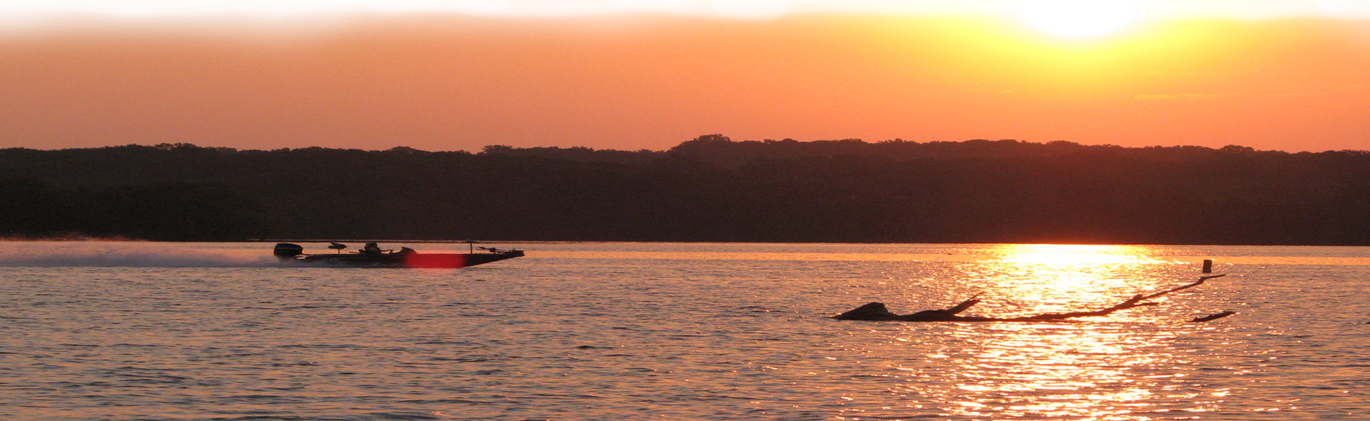
Here are my personal picks for catching bass during winter.
-
They'll be posted here:
-
Just checked, and it looks like they don't have XL at the link, but just wait a week or so and they'll restock. That's what I did.
-
It fits true-to-size. I wear XL, and it fits me fine.
-
Yep, this is what I got, due to the high-speed impact rating (100mph). Comfortable too. https://amzn.to/3efkQHk
-
Nah, not one of mine. But a Googan vid? I can see it now: "Insane Prototype Pantie Pattern for MONSTER bass! EPIC Challenge!!!"
-
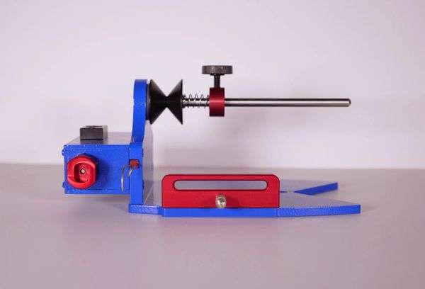
Here's an honest video review of an awesome new linewinder that may be the last one you'll ever need! http://mvnt.us/m1165354
 Here's how to fish it.Not even mid way through, and the NFC West has a combined 19-8 record...the best in the NFL. And all 4 teams have been to the Superbowl at least once in the past 11 years...6 in the past 11 years to be exact. Since an "extra" team will make it to the playoffs this year, there's a very real possibility all 4 NFC West teams will be in the playoffs this season. And in the AFC, there's just a few strong teams that each dominate their division. Some divisions (NFC/AFC East) are lagging well behind. Given the widening gap between the have's and have-nots in the NFL, I wouldn't be surprised if the NFL re-orged the divisions soon. As in next year. We'll see.Should've mentioned this earlier, but it's good to see you posting here again!Error code 2F173/F simply means the topic was removed. You're not banned, and there's nothing wrong with the site. We had a couple of back-to-back trolls try to stir things up. We simply cleaned up some troll fodder. All is well now.Thanks for the input guys! I appreciate it.Fall can be tough fishing as the fish transition to Winter. Combine that with fishing a new lake, and, well.... So I made this video to help you out!It's been a rough fire season for sure. Glad you were spared.Rum & Coke for me tonight. Used to love this stuff! But now it's just too sweet for me. Henry Weinhart's Root Beer is my choice now. Perfect after a hot summer day on the water!


Important Information
We have placed cookies on your device to help make this website better. You can adjust your cookie settings, otherwise we'll assume you're okay to continue.